A brand that stands for being REAL
In 2020, Gemice was repositioned as a "natural" brand. With that, come with the upgrade of all of Gemice's product using 100% pure cow milk, without added water. Each cup of ice cream equates to one cup of milk. For the packaging design, we wanted to convey the proposition of "Gemice raw milk" and all the flavours hence photography were taken without any filters, to showcase its authentic taste. The packaging design has a simple background, to have the ice cream stand out and to increase appeal. A packaging design concept that's in line with natural and authenticity, fitting for a brand that stands for being real.
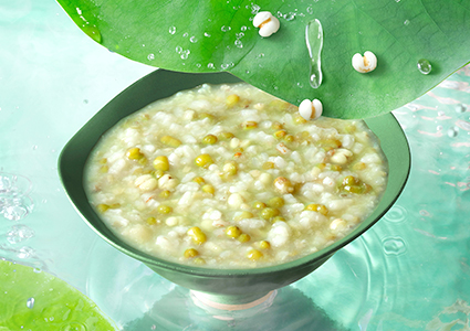
Related cases
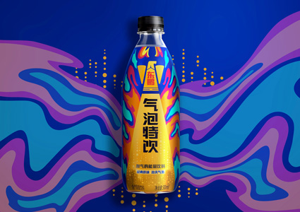
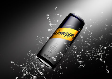
Refreshing Bubbles with Vibrant Energy
Read more
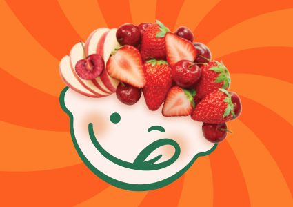
The baby meal that starts with a smile
Read more
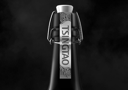
TsingTao Artisan's Brew Beer Limited Edition
Read more
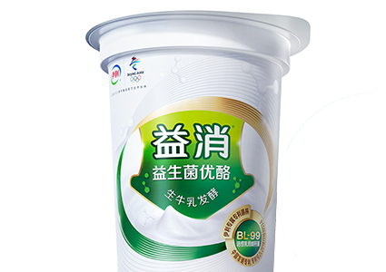
A contemporary dosage of probiotics
Read more

A gut feeling that proved successful
Read more

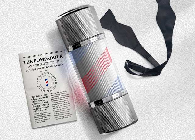
The Pompadour pays tribute to the golden age of barbershops
Read more
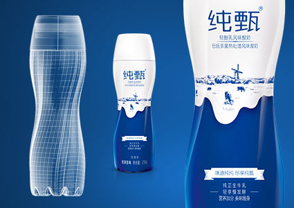
A Modern and Stylish New Yixiao Yogurt
Read more
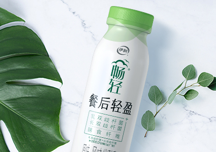
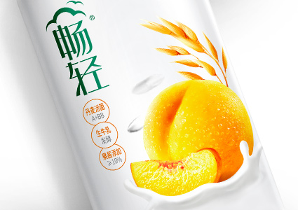
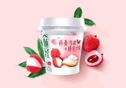
Chang Qing enjoy the lightness
Read more
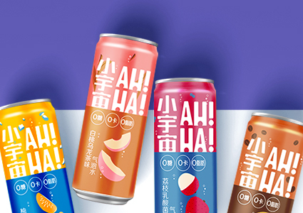
The Coca-Cola Company - AHHA
Read more
Reinvigorating a real bubbly personality
Read more
Standing out in style
Read more
Crafting a culture of natural goodness
Read more
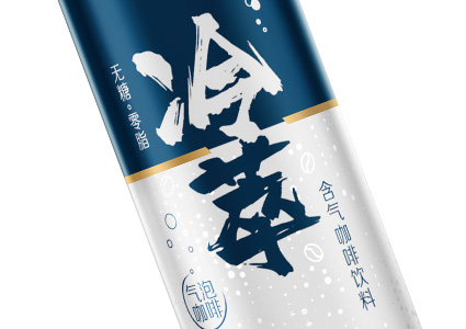
Yili Sunrelas Cold Brew
Read more
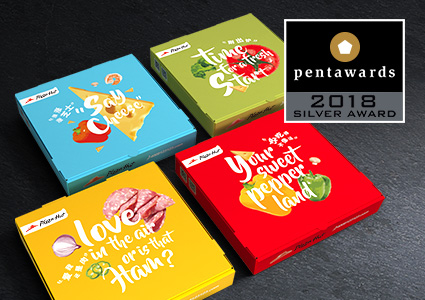
Catchy, cheesy and topped with humour
Read more
Still a Star at 30
Read more
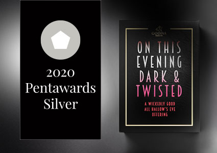
Silver award in the Packaging Concept Professional (Food) Category at the Pentawards 2020
Read more
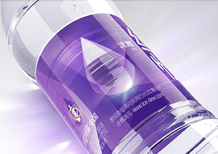
Purity that's crystal clear
Read more
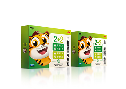
Let's Go TIGER
Read more
Sculpted for smoother success
Read more
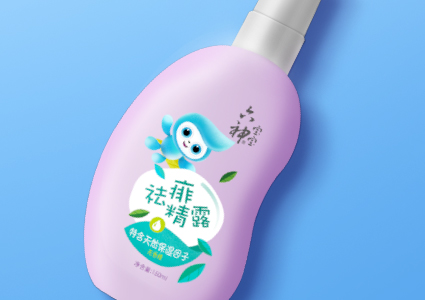
Here comes the new Liushen babies
Read more
Double the celebrations, double the flavour
Read more
Styled for coffee lovers on the go
Read more

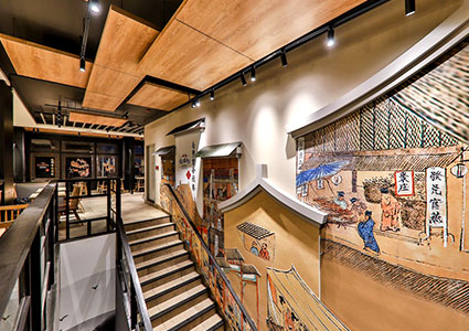
When a store becomes a National Gallery
Read more
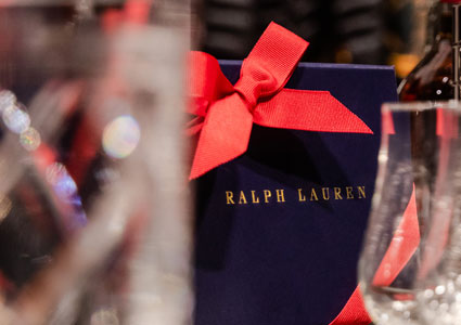
A luxurious pairing of fine fashion and whiskey
Read more
Afternoon Tea with an Impression
Read more
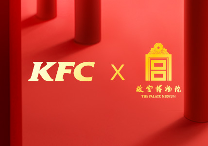
Welcome Oriental Flavour of The Palace
Read more
Summer at The Forbidden City
Read more
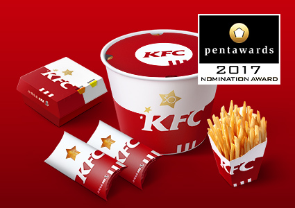
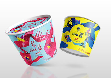
Have a warm winter with KFC Breakfast
Read more
