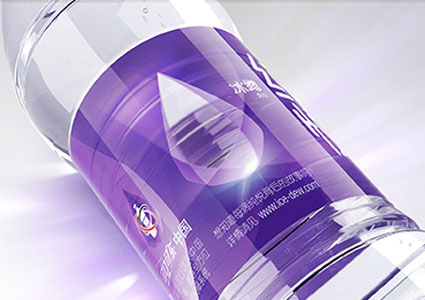
Capturing coffee culture in a bottle
Based on the previous desktop research and analysis of market competitive product audit, industry design language review, brand target audience interpretation, etc., it is finally confirmed that the simple and high-end design tonality of "slash youth" is used to define the brand. In the design of logo, considering that as a brand-new coffee brand, Sunrelas still needs accumulate brand visual assets through obvious category identification symbols. Therefore, we make the design of brand logo in the form of horizon rising in the sun + coffee beans combined with the English name "Sunrelas". According to the simple and high-end brand tone, the font of Chinese name adopts the style of balanced strokes to demonstrate fashionable and young brand image.
After setting the brand tone, we continue to take the creative direction of "slash youth" as the basis, extending the unified visual performance to the packaging of various tastes. The contrast expression of brand blue and taste color enable the packaging with stronger visual expression on the shelf and jumps off among similar competitive brands. As a brand super symbol, "slash" extends from packaging design to all dimensions of consumer touch points, enhancing brand identity and consumer identity.