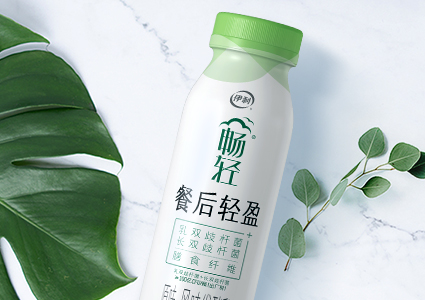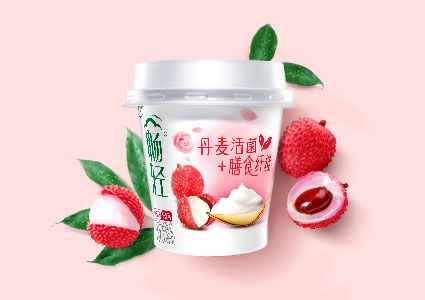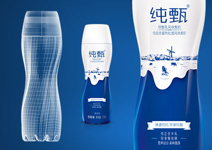
In 2019, Yili ChangQing brand revamped its brand positioning to “high-quality yoghurt that relieves body stress. At the time, its Tetra Pak design was seen as outdated due to lack of pack design upgrade in 3 years and a flood of new Tetra Pak designs by competitors in the market. The key competitors also upgraded its Tetra Pak design, which enhanced its on-shelves appeal and began looking very similar to ChangQing’s Tetra Pak designs. This posed as a real threat and called for an urgent need to upgrade the brand’s packaging.
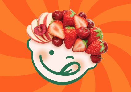
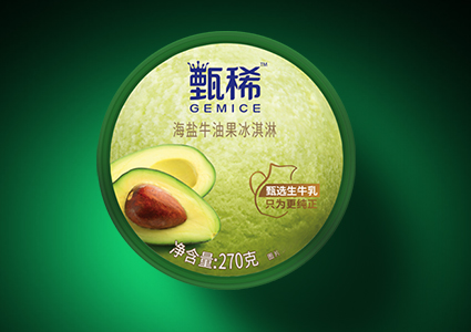
Intention of new design is to refine and simplify, presenting selling points in a concise manner that consumers wouldn’t miss. To elevate the functionality of existing products, the new designs utilized images of oats and real fruits wrapped in milk. Fruits are shown in full and cut with water droplets to depict freshness and juiciness. These elements combined are able to enhance appetite while retaining the product’s identity. Considering colour limitation for Tetra material printing, special color separation management was used to ensure designs stay true to intended creative idea with enhanced 3D visualization. The overall use of a simple and clean design resulted in a delicious, premium, and trendy looking packaging.
Not only did the new design attract people’s attention while retaining brand recognition, it also stood out from competitors, which lead to increased purchase intent and sales conversion. Proving that humanized and thoughtful packaging design yields mouth-watering results.